How AMC's Interview With the Vampire Can Teach Good vs Great Costume Design
What is it about the costumes of AMC's Interview With the Vampire and other shows and movies that makes the difference between awful and amazing?
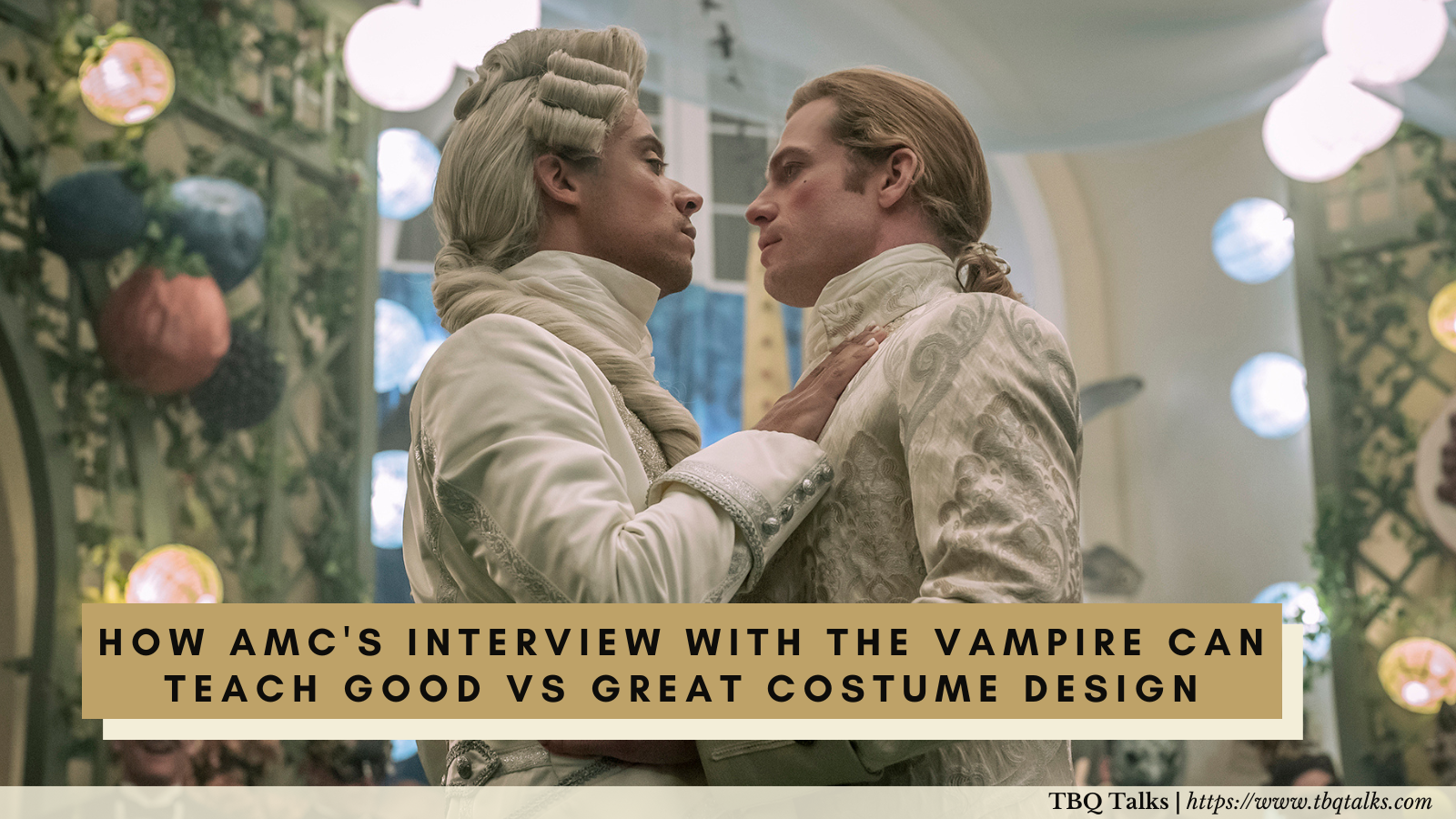
Warning: The following contains spoilers for the first season of Interview With the Vampire as well as the Vampire Chronicles books. Additionally it talks about Kevin Can F*ck Himself, Loki, WandaVision, Falcon and the Winter Soldier, Only Murders in the Building, and Black Panther, but for all of those we’re sticking mainly in details that could be found in their promotional materials. Even so, you’ve been duly warned so read at your own risk.
Intro
AMC’s Interview With the Vampire has very good costume design. I want to say that right off the bat because I think there’s a risk that I’m going to give the impression I think otherwise. I don’t. I think Carol Cutshall and her team did an amazing job. If they won an Emmy for their work I would not be upset in the slightest, and regular readers know how picky I am about who gets awards for costuming.
The clothes on AMC’s Interview With the Vampire are gorgeous and look beautifully made to boot. I could sit in front of Lestat’s outfit in the title card of this article and spend hours just looking at the choice of fabric, let alone how the garment was put together and then styled to acknowledge that this outfit represents the century Lestat is from and thus most comfortable with. Beautiful, beautiful work.
The confusion, if there is any, is going to come in with how I’m going to use the costumes from AMC’s Interview With the Vampire to illustrate the difference between good costume design and great costume design. But please understand I mean this as a compliment because the costume work on the show was so good it was confusing me why it wasn’t great. It’s like spending days baking and decorating a wedding cake and then leaving off the topper of the happy couple. Yes, the cake still looks and tastes amazing but what an odd place to leave it unfinished.
This also goes to how from the very first episode all the way through to the last I kept writing about how I was taking a wait and see approach with the costumes on this show. Because - and I’m just going to abuse this metaphor to death now - I kept wondering where the cake topper was. This is a gorgeous cake, why was there no topper? So much so that I started wondering if the lack of topper was on purpose as part of the good design.
So I’m going to explain what was going on. Why are the costumes on AMC’s Interview With the Vampire so good but what were the tiny little missing pieces that kept them from being great? And to do that I’m going to compare it to shows that did some things better, one show which did it much worse (regular readers know which one already), and of course the ne plus ultra of costume design which is anything Ruth E Carter gets her hands on.
Now full caveat that a single article can’t cover everything that makes up good costume design by a long mile. As it is I had to cut out a lot of points and examples I wanted to include because this is going to be image heavy even in a pared down version. So the aspects we are going to zero in on is how costumes tell a story about the characters, particularly in relationship to each other. And the aspects of that we are going to focus on are silhouette, pattern, and color.
Also I apologize in advance for how often I’m going to have to say “AMC’s Interview With the Vampire” during all this. It’s because in my research for this article I realized you do have to specify if you mean the show or the movie, so this is me paying it forward for those down the line who have the same need.
Anyway, let’s get started!
What Goes Into Costume Design?
To talk about what goes right with costume design we need to talk about, in broad strokes, what is needed in costume design.
First and foremost, generally speaking you want your characters to be wearing clothes. Obviously full caveat for moments like an exposition scene in early episodes of Game of Thrones but still, point being you hire a costume designer for your project because you want your characters to not to be naked.
When a costume designer chooses clothing for the characters, the next things they think about are what pieces of information can the clothing give about the characters? The starting point here will be basic character information: Who are they? Where are they? When are they?
These questions aren’t being listed in any order of importance. But idea being your inspiration board is going to look vastly different if you’re working on a sci fi show taking place in a galaxy far far away than it will if you’re doing a modern day high school drama. From these broad strokes you would then narrow down to, hopefully, use clothing to tell the audience something about the characters: are they rich or poor? Young or old? Respected or outcast? And so on.
All of which is the bare bones requirement for a costume designer to do their job. If I hire a personal accountant the bare bones requirement is they need to be able to do my income taxes. If I hire a costume designer the bare bones requirement is that they know not to dress the people in my Tudor era romance like a police procedural that takes place in 1980.
Moving up from bare bones to things which add quality, we start to take into consideration things like what’s the goal for the project? What’s the tone? For example, while Euphoria and Bridgerton are modern day and historic respectively, neither show is interested in clothing which is accurate. Instead they want costumes which evoke style and mood more than realism, and the costumes on both shows do so wonderfully.
The final piece to the puzzle, and the one which is often hardest, is can the costumes tell a story on their own?
We’ll get into how costumes can tell a story in a second, but for a great example of what this even means we can look directly to Carol Cutshall in the work she did for Kevin Can F*ck Himself. The show is the story of the typical beleaguered sitcom wife, and how the things the husbands in those types of shows do can actually be abusive to their wives and those around them. This was something Carol Cutshall used when deciding on costuming. She could have stuck to the basics: have Kevin and Allison be dressed in modern clothing appropriate to people living in Massachusetts. But instead she did the extra, greater, step of including details which support the narrative of the show. For example, reflecting how Allison is always struggling for money by the way she reuses garments while Kevin, who abuses their finances, can be spotted wearing brand new expensive sneakers.
You see the difference? Good costuming is Allison wears clothes and Kevin’s clothes include sneakers. Great costuming is a designer carefully keeping track of making sure Allison reuses a limited wardrobe while making sure Kevin’s sneakers are expensive.
Now if you don’t know things off the top of your head like the average price of a pair of sneakers, you can still pick up on stories being told by costumes by simply looking at them. To start with, costumes can use pattern and silhouette.
Ways Pattern and Silhouette In Costumes Can Tell a Story
AMC did an interview with Carol Cutshall where one of the things in particular they called out, right in the headline even, was how silhouette was used to tell the story. I say with all due respect when I read that my immediate reaction was “Sorry, it did what now?”
Then we get into the interview and we find that the examples being used are things like this:
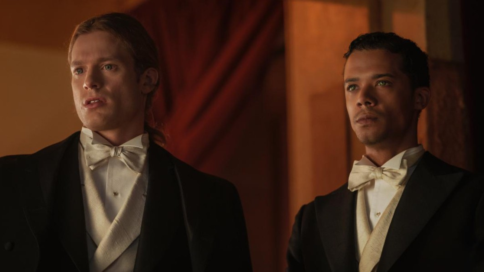
Which… okay. I mean technically true but this is immediately where the problem starts.
As regular readers know, I have a magic ability to figure out what went on behind the scenes of shows purely based on what I’m seeing on the screen. And I called back in episode two that Carol’s lack of experience with historic projects like this was getting in the way of her ability to use costumes to tell the story. Cut to a few weeks later (November 7, if you want to be precise) when I took a look at Carol’s Instagram and saw, sure enough, she was not creating new outfits for the show, she was copying existing designs and occasionally tweaking them a little.
Now make no mistake, taking on AMC’s Interview With the Vampire was a monumental task for a costume designer. Even one who had plenty of historic experience would’ve been daunted by the job of putting together a season that spanned multiple decades and required detailed costuming for everyone from the leads down to the blurriest of extras all the way in the back. The fact that Carol and her team were able to do this at all is incredibly impressive. This is not a fail, this is not something we’re mocking, this is not something worthy of disrespect in any way. This was very good work. I can’t stress that enough.
But when it comes to our point of good vs great this provides a perfect example. And we can do that right off the bat without you, personally, knowing a lick of historic information.
Take a look at that picture again. What do you see? Two men wearing more or less the same outfit. There are some tiny differences but not enough to be significant, so they’re by definition not worth noticing. The outfits are tuxedos, which suggest a formal event.
Based on this information what could we conclude about this moment? If you knew nothing else but this picture, what might you guess about these characters? Possibly that if they are wearing the same outfit they are the same in some way? They share a status, whether it be as guests of this event or as very stylized cater waiters?
Here’s the problem: that’s not what’s happening in this scene.
In this scene, which is episode two, aka when I started to peg what the issue was, Lestat and Louis are going to the opera. We’re told in the show that, because of racism, the only way Louis was allowed in the theater was if he pretended to be Lestat’s servant and then quietly slipped into the seat beside him once the lights went down.
Now the setup for this scene is a hot mess to begin with. For starters the show also tells us that Louis is well known in town to the point where he has secret poker games with politicians. So the idea that they could play off that Louis was Lestat’s servant instead of his well known business partner is stupid right out of the gate. But regardless that’s the setup and that’s not what the clothes are showing.
Yes, Lestat is a vain popinjay. I would absolutely believe that even if Louis was his servant he’d want him dressed very well, even to the point of making a scandalous statement by having him in the same outfit. But now we’re trying to guess story instead of the clothes telling us. We could go down this route of trying to Rosetta Stone the shit out of this - believe me, I spent weeks trying - or we could skip to the end which is that Carol just used an existing picture.
For Louis and Lestat in particular, Carol used the works of JC Leyendecker, a famous artist who defined much of the idea of what the 1920s and 30s looked like, particularly in men’s fashion. Extra notably, JC Leyendecker was in a relationship with Charles Beach, his artistic muse, and included subtle hints of that in his artwork. (And let’s pause for a moment to admire how the Wikipedia article only grudgingly allows that maybe the guy who never married and lived alone with another man for decades might have not been straight.)
You can see why Carol went to Leyendecker for inspiration. Frankly it would’ve been weird if she hadn’t. But when she pulls directly from the story Leyendecker tells that’s going to get in the way of the story the show is trying to tell.
To see why, I’m going to hit you with three pictures. Take a look at them and tell me, based purely on the picture, which one depicts people who have the closest relationship.
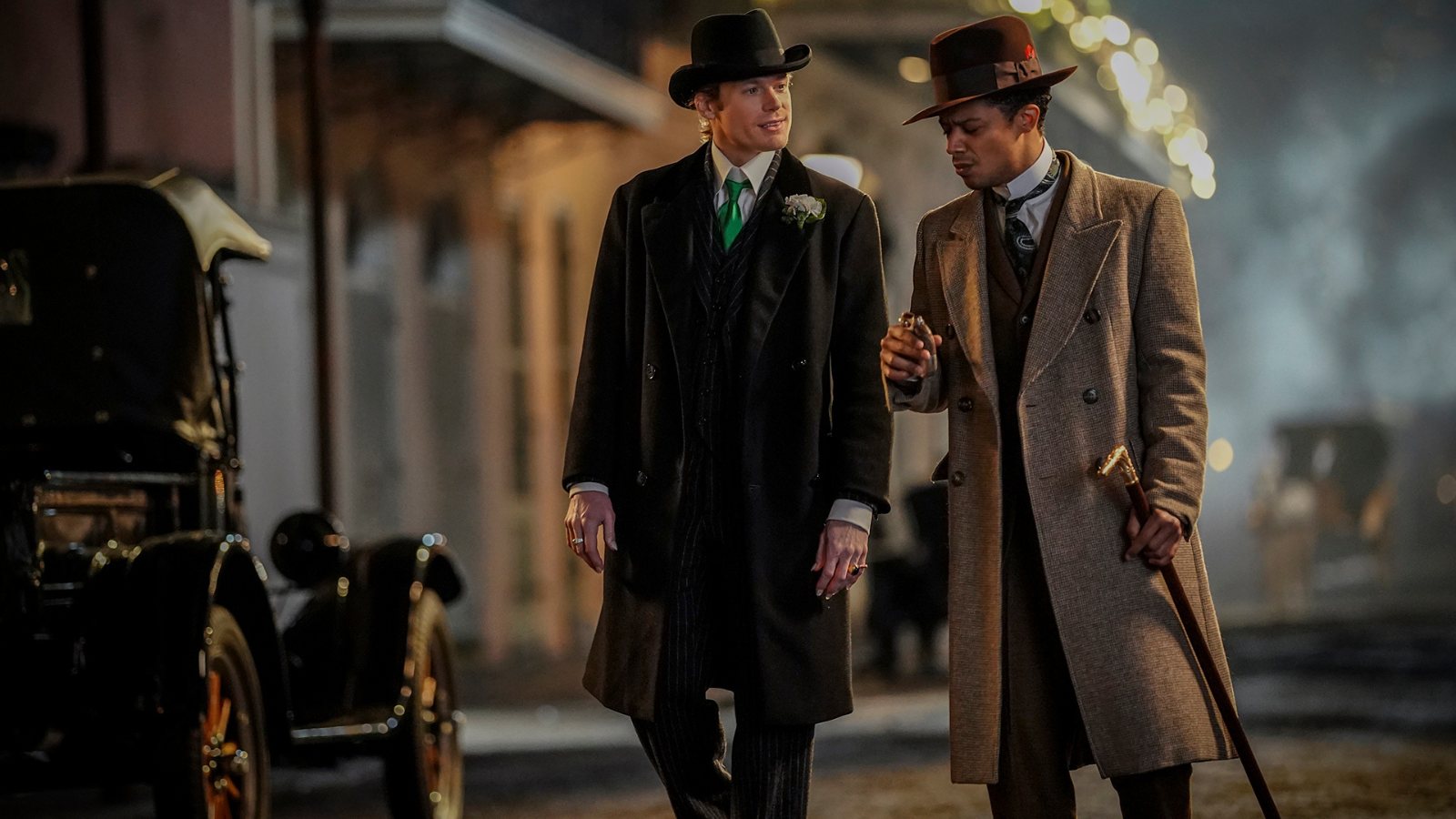
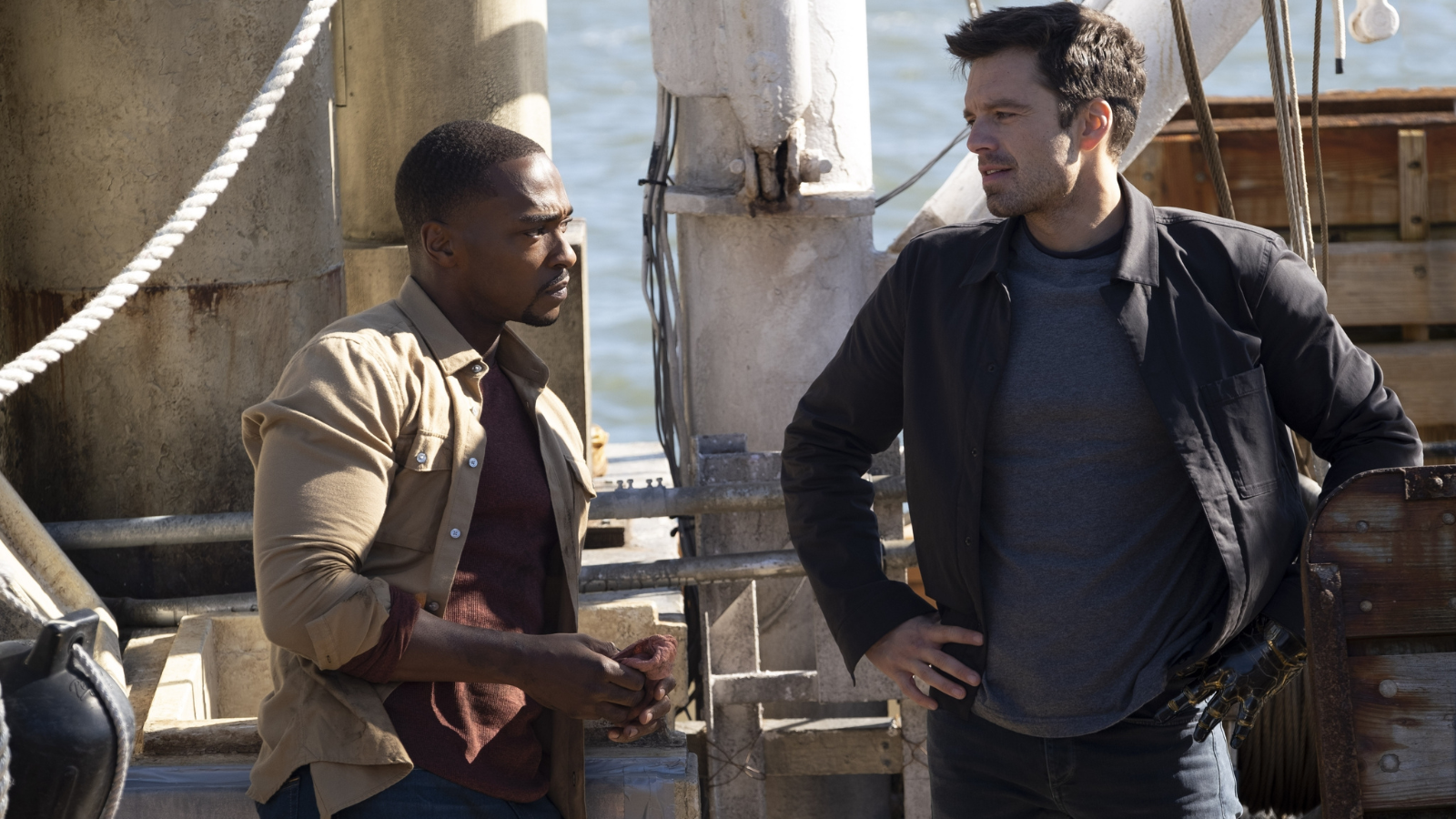
Got it? They’ve all got similarities: two people next to each other. Same gender. We even have the combo of one character is Black while the other is white. If you know nothing about the stories, which of these three looks like two people who feel close to one another? Who are feeling a drawing sense of connection to the person they are with? Who feels most like a pair of people who want to be together, however “pair” is being defined?
Let’s go a step further. In your head, match each picture to the following scenarios: 1) two people who could be friends but maybe not 2) two people who are becoming close friends 3) two people who are desperately falling in love.
Are you maybe kinda coming up empty on that last one? Finding it hard to pick which picture it goes with? Because the picture that supposedly shows that, which is Louis and Lestat’s, doesn’t actually show it?
Why is that?
To start with, look at the silhouettes.
Silhouette, in basic terms, is the overall shape of the outfit. It’s how you could tell the difference between somebody wearing a cheerleader uniform vs Princess Diana’s wedding gown if all you saw was the outline.
Of these three photos, the ones who have the most similar silhouette is Bucky and Sam. They aren’t wearing the exact same clothes, but they both have jeans on, they both have layered tops on, and the tops are both a loose fitted, round necked shirt covered by a light shirt or coat where the latter both have the same shape of collar. They aren’t identical but they are complimentary.
(Especially when we get into color, but we’ll talk about that in a bit.)
The picture comes from episode five of Falcon and the Winter Soldier, in which Sam and Bucky become closer friends as they work on Sam’s family’s boat. But throughout the course of Falcon and the Winter Soldier, the costume department (lead by Michael Crow and Eric Daman), make sure to put Sam and Bucky in outfits with similar silhouettes whenever the two of them are working and feeling like a team. Even when they are with other people, like Sharon Carter and Baron Zemo, our eyes can immediately clock that Sam and Bucky have a connection to each other that they don’t to everyone else.
Now how about WandaVision?
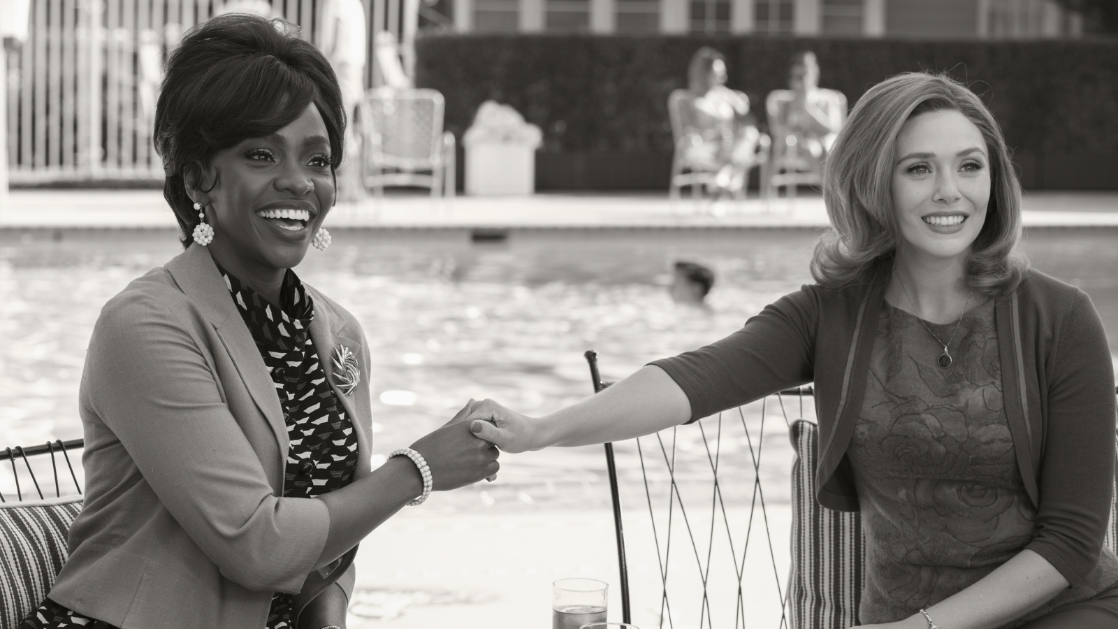
WandaVision had ridiculously good costume design done by Mayes C Rubeo and Daniel Selon and I’ve waxed orgasmic about it before. I’ll accordingly restrain myself from retreading that ground, but for our purposes we luckily can keep it to two photos.
In the show, Monica is sympathetic to Wanda but still has to try and stop her. Accordingly, she and Wanda sort of kind of have similarity in their silhouettes, but nowhere near like Bucky and Sam. They are layered, like Bucky and Sam are, but there’s enough differences in these outfits that we can tell okay there’s a connection but it’s not a strong one. The collars aren’t the same, the coat and cardigan don’t fall in the same spots, Monica is even accessorized differently to create even more contrasts.
Now what takes this to the next level is that, if you watch the episode in question, during this particular scene there are only three people who have layers like this. They’re at a meeting and all the other women have dresses on but only that one layer. Which means that, with that added context, we are being told Wanda and Monica, while not as connected as people in outfits like Bucky and Sam’s, are still more connected than they are to anybody else in that scene.
Except the third person, who I’m getting to. But to fully appreciate that let’s also look at what else is going on with Wanda and Monica: pattern.
WandaVision provides a great way to observe what pattern can do for a story because WandaVision manages to use pattern even in black and white. In fact, it has to heavily rely on pattern because it’s black and white. Subtle differences between one shade of grey and another aren’t going to cut it, so they need to make up the difference in what the fabric looks like.
Bucky and Sam’s outfits are solids. By both being in solids, they match. Their patterns - or the absence of pattern in this case - help to show us that they are connected.
Wanda and Monica, conversely, do not share patterns. Not only that but their patterns do not match. Wanda is in soft, round florals while Monica has a more abstract design where we can see corners and straight lines. Even with no further context you can see these two aren’t fully connecting. They are puzzle pieces that do not fit. And that’s without even getting into the ridiculous extra effort (that good vs great, where with WandaVision it’s very much great) that the pattern on Monica’s shirt matches the static that’s used to represent the barrier between the fantasy world Wanda has created and the real world. Before the show reveals it, Monica’s shirt is telling us she does not belong here.
The third person in the scene is Agatha Harkness. Agatha, like Wanda and Monica, has an extra layer. In her case it’s a long sleeved blazer. Because she’s the only other person in the scene with that extra layer, this tells us that she’s connected to Wanda in ways that the others aren’t in the same way that Monica is connected to Wanda in the ways that the others aren’t. But, like Monica, Agatha doesn’t fully share a silhouette. Her blazer doesn’t lie against her the way Wanda’s short cardigan does, the sleeves are long while Wanda’s are three quarters, and the collar of both Agatha’s coat and dress are nothing like Wanda’s.
But, as regular readers of the site know, there was something which differentiated Agatha from Wanda even more than silhouette. Agatha is a master example of the use of pattern:
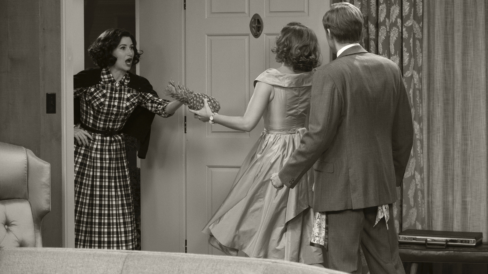
This is from the first episode of WandaVision. From the moment we meet Agatha (which happens earlier than this scene) she stands out from Wanda because she is always in plaids. Much like Wanda and Monica, Wanda and Agatha sort of kind of share some silhouette details. They’re both in dresses, for example. But notice how the collars are different, the sleeves, the way the skirt falls, and so on. They’re connected but not really.
Then throw the pattern on top of it and boy howdy are the costumes making it loud and clear that these two are not going to be friends. Much like Agatha herself, it’s a trick. We think they maybe could go together but nope, turns out not.
(And again for extra bonus credit, in the earlier mentioned meeting scene Agatha even has plaid on her blazer, a visual hint that the similarity suggested by her having that layer isn’t to be trusted. Are you starting to see what I mean by good vs great?)
With all of that, let’s look at that picture of Louis and Lestat again.
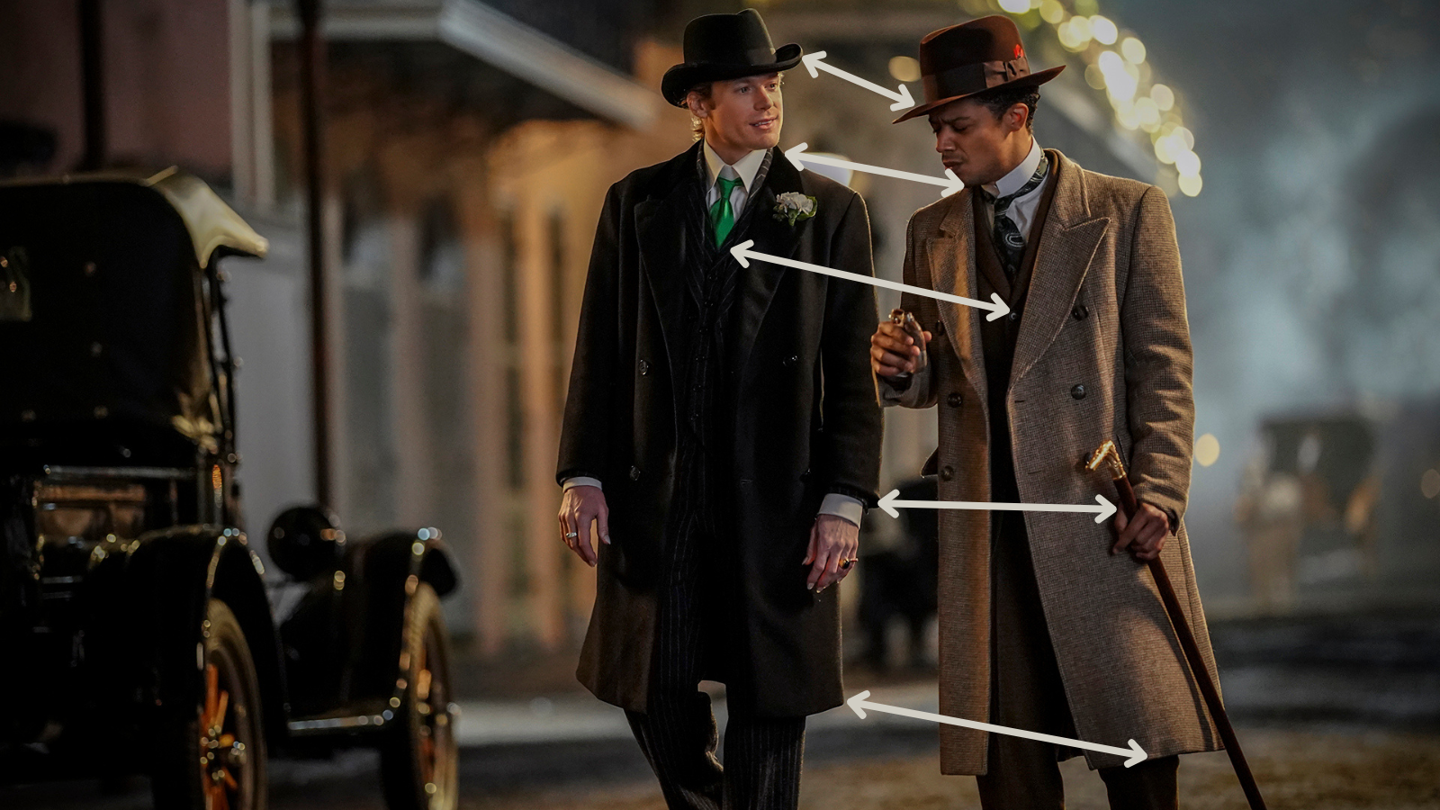
Yes, the two of them are wearing suits, overcoats, and hats. But that is a “Monica, like Wanda, is also wearing an extra layer.” When we take a look at the clothes themselves it starts to fall apart. Going from the top down we see the hats aren’t the same. The shirt collars are so different Louis isn’t even wearing his tie in the same way. The patterns (Lestat in thin pinstripes, Louis in solids) don’t match. Plus the silhouette resemblance is only superficial. Look at where Lestat’s sleeves and the bottom of his coat fall in comparison to Louis’. It’s harder to see given how dark Lestat’s clothes are but the lapels on their coats don’t match either.
Now there’s nothing wrong with these outfits as a concept. They’re beautiful. Sam Reid and Jacob Anderson look gorgeous in them (with of course the obvious caveat that Jacob Anderson would look gorgeous wearing nothing but a paper bag). But what story are they telling?
This is supposed to be the moment when Louis and Lestat are most desperately falling in love with one another. What in the clothes suggests that? What in these clothes says these are two people with a deep, soul changing connection? Ignore the body language. This is a period of history where they couldn’t so much as hold hands in public. But because of that the clothes should be doing more of the heavy lifting here.
But, again, they aren’t because these clothes are from someone else’s story.
The problem with taking inspiration from somewhere else is that it comes with the baggage of that somewhere else unless you do something to translate it for your own work. Imagine you’re reading a romance novel where the main characters are named Romeo and Juliet. You’d spend your time expecting at least some aspect of two groups who don’t get along, some version of love at first sight, and some sort of tragedy as a significant part of the story. If none of those elements are there you’d wonder why the names Romeo and Juliet were used, right?
This is what the costumes were doing on AMC’s Interview With the Vampire. They’re very good. They’re evocative of a story. It’s just not this story. Even if we get out of arguably more advanced concepts like the meaning of subtle differences in silhouette, there’s basic story information like where do the characters live and what time of year is it? It’s great that Carol took inspiration for Grace and Levi’s outfits from Oscar and Jessie DePriest but Congressman DePriest and his wife hailed from Illinois, which hits temperatures way colder than New Orleans ever does. Why do Grace and Levi even have outfits this warm? Why are they wearing them while still in New Orleans? Is this suggesting something about their financial state? A message they’re trying to send Louis as they say goodbye to him for the last time? Other?
Before anyone gets into it - I lived in New Orleans. I know it can get cold. I’ve been out at midnight in the French Quarter bundled up in layers and wool cloak. I’m not disputing that. I’m just saying that the few scattered days during fall and winter that New Orleans briefly hits those cold temperatures are not enough to make a full winter wardrobe something a native would keep on hand. And if the show was trying to say that this particular night was one of those cold ones in question, nothing else going on suggested it.
All of which goes back to the point that the costumes themselves are causing confusion. For another example, take Lestat in his straw hat. The style suggests summertime, except in the relevant scenes Grace has a fire going in the fireplace at home. Again, having lived there, I can assure you nobody is lighting a fireplace in New Orleans in the middle of summer. Not even at night. It’s 100% humidity and temperatures that go into triple digits in Fahrenheit. Absolutely no one, least of all mortals, is fighting off a chill. Now while I suspect the fire was the lighting designer desperately trying to find ways to make period scenes visible enough to be caught on camera, the problem is it’s still a fire happening while Lestat and others are in summer clothing. So which is it? Remember earlier one of the things we’d ideally like costumes to do is tell us when the characters are. What time of year it is should not be something we’re confused about.
And this is just talking about the basic clothes themselves. Now let’s throw color into the equation.
How Color in Costumes Can Connect Characters
I love alliteration.
Color is another tool in the toolbox of how costumes can tell stories. It can talk about characters themselves, such as how Louis’ color palette at the start of the show was meant to be gold to symbolize that he was like the sun and stood out from the crowd.
Now I’m going to do a brief sidebar here to acknowledge that post production did costuming dirty by washing out the colors. Again and again Louis’ supposed gold came out dirt brown. This is, unfortunately, all too common with period pieces. Fake History Hunter has a great thread about this when discussing the accuracy of The Northman. The tl;dr summary is that the costuming department on that movie was brilliantly accurate, including the use of color in that time. And then it was completely washed out by Hollywood’s persistent belief that if you’re showing Vikings you’re required to slap a blue/grey filter on everything. Fake History Hunter even used Photoshop to do a great comparison of what it looked like in the movie compared to what the costumes actually looked like.
Gorgeous shot.
— Fake History Hunter (@fakehistoryhunt) October 22, 2022
See, there are colours!
And it looks even better when I fix it in photoshop.
GREAT costumes by the way, amazing detail in everything, truly superb.
And no black leather motorcycle gang members anywhere! pic.twitter.com/NhUJsiAQsB
So we’re not holding the dirt brown against costuming. Instead we’re giving full credit for how Louis, when in outfits like this, is meant to look like golden yellow. Now part of the issue is that Louis doesn’t always wear that color and it’s very hard to spot a through line as to why but we’re putting that aside for now to talk about color and relationships.
When Claudia enters the picture she also has a costume story for herself. Her clothing depicts where she is mentally from teenager to adult, and it does an excellent job of doing so. I do have a minor quibble with the rationale to initially dress Claudia as a doll because she’s referred to as a doll in the books. Reason being Claudia in the books is five. She looks like a doll because she is the size of a doll.
Claudia on AMC’s Interview With the Vampire, on the other hand, is 14. If you’re dressing a 14 year old like a doll we’re getting into a whole different kind of creepy territory. Territory which Claudia’s story in all forms evokes, granted, but still. Again we’re back on are the clothes telling the story we mean for them to tell?
Regardless, my personal opinion that dressing this version of Claudia like a doll was a miss is more than counterbalanced by how I appreciate details like how when Claudia was on the run her wardrobe was eclectic and reflected how she was stealing many of the pieces as she went. Great detail. One to one match of the story being told by the show and the story being told by the clothing. Perfect.
Where complications come in is when Claudia is with Louis and Lestat. Because, in much the same way that Louis and Lestat’s clothes struggle to tell the right story, Claudia’s clothes muddy things even further. Case in point:
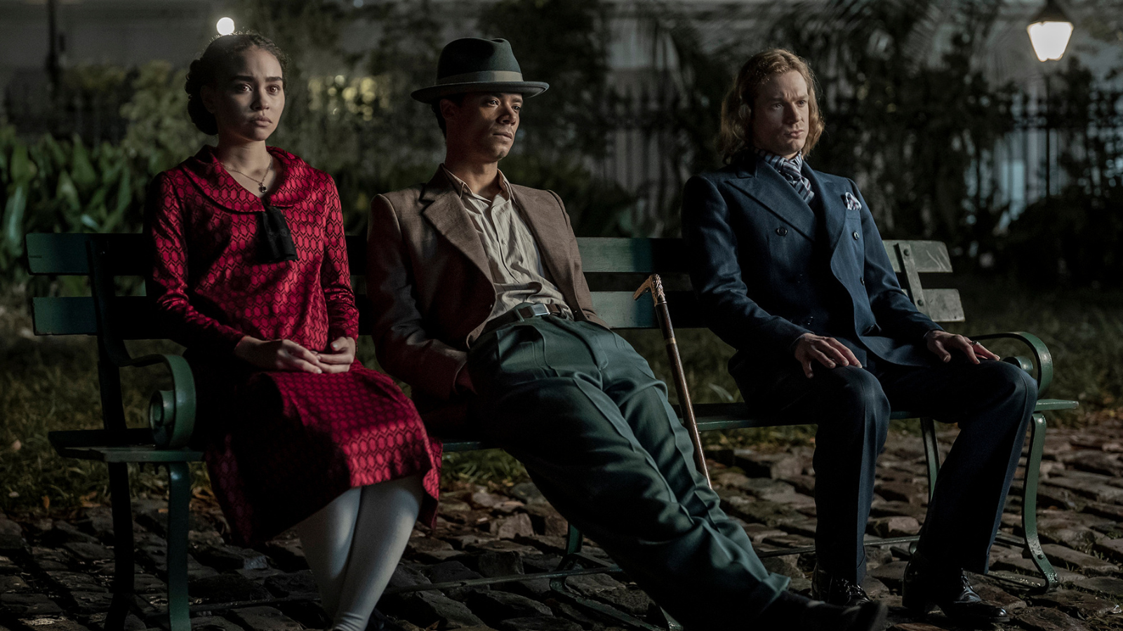
When I saw this photo I immediately DMed a friend of mine who had seen the entire first season of the show before I had and asked her if it was revealed that Claudia had been manipulating, and thus betraying, Louis and Lestat the whole time. When she told me that no, there was nothing like it, I said alrighty then and went back to staring at this photo.
These costumes don’t work. I mean they’re fine in and of themselves. Claudia’s says something about Claudia, Loius’ about Louis and so on. But we’re getting nothing about their relationship to each other. Or, rather, what we’re getting tells us that these people aren’t connected at all and probably don’t like each other very much.
(Again, don’t worry about body language. We’re getting there, trust me.)
You already know how to look at what Louis and Lestat are wearing and see how the outfits don’t work together. There’s no similarity going in silhouette or pattern. It’s not even subtle: Lestat’s in a buttoned up three piece and Louis is in a much more relaxed shirt, pants, and jacket with a hat on. Solids vs stripes are in play again as well as different textures.
But what about Claudia? She’s female so of course she’s bringing different silhouettes to the party. But this is where pattern and color start coming into play.
Pattern you can see right off the bat: that fabric, which I’m guessing is either meant to evoke stained glass or wrought iron artwork (and either way I love the choice given the setting), in no way connects her to what Louis and Lestat are wearing. It doesn’t even remotely resemble anything they’re wearing to even hint which of her two dads she’s supposed to feel closer too. (It’s meant to be Louis, the guy sitting so close to her they’re almost touching. See how body language doesn’t help?)
Then we get her color. Repeatedly throughout the show Claudia’s signature color is red. Which is great. It looks wonderful on her. My guess is it’s meant to symbolize the blood she spills as a vampire. What it doesn’t symbolize, though, is her relationship to the two most important people in her life.
Why? Let’s talk color.
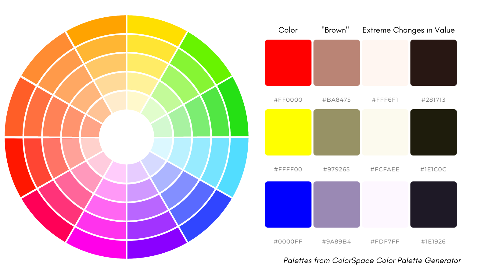
If you go back anything vaguely resembling an art class in your life, you might remember something like what’s pictured above: a color wheel. This goes to the whole idea of color theory which could be lessons in and of itself. For our purposes I’m going to pare it down.
First up, there are three things that go into color: hue, saturation, and value. Hue is color itself. Red is a different hue from blue. If you go clockwise or counterclockwise around that wheel pictured above, you’re traveling between different hues.
Saturation is how rich or intense the color is. So if you walk from the center of the above circle in a straight line to the outside, turn around and go back to the center, you’re walking back and forth on different levels of saturation.
Value is black and white. Now this can be literal, such as when you look at the first few episodes of WandaVision, but it can also be how much black or white you add when mixing colors together. The rows of color to the right of the wheel are examples of what happens when you make the same changes in value to red, yellow, and blue respectively. To illustrate this we’ve gone to the extremes of showing that even when you get the colors as close to white and black as possible, there are still differences in hue.
(There’s more going on there which I’ll get to. For now just notice how the columns of whites and blacks don’t look the same. We’ll get to “brown” later.)
What color theory says is that, generally speaking, humans like seeing certain colors together. It’s no coincidence that the layout in a color wheel follows the order of colors in a rainbow.
Because of that order, there are two ways that colors can be put together that work well: analogous and complimentary.
Analogous simply means next to each other in the color wheel. Orange is next to red and yellow, so the three of them can hold hands and be color buddies.
Complimentary means directly opposite each other on the color wheel. Orange is opposite blue, which means they might not have anything in common but they make each other look good. When you watch decorating shows and hear them talk about a “pop” of color in a room, what they usually mean is that they’re including something in a color that is complimentary.
What doesn’t work with the color wheel is if you hop around willy nilly. Orange can pair up with red, yellow, and blue. It can’t pair up with fuchsia. Or it can but it’s going to look a hot mess because the colors aren’t meant to go together and frankly do not want to. If you think back to playing with finger paints as a kid and remember when you were having a great time mixing colors together until suddenly your paint turned to mud and you didn’t know why? Odds are good you tried combining colors that weren’t meant to be together.
(This also gets into things like “hot” colors vs “cold” and like I said it’s a whole thing. We’re keeping it simple. Try the links above if you want to dive deeper into it.)
Colors are so evocative and effective that they can tell stories entirely on their own. In Falcon and the Winter Soldier the color red was used to symbolize an optimistic future. Sam is wearing red in the picture of him and Bucky we used earlier. He continues to wear more and more red as he feels hope for the future and increasingly believes he has the right to take on the mantle of Captain America.
For his part, Bucky is in blue. Blue had its own symbolism on the show (people affected by Captain America’s impact) but as an added bonus his blue matches Sam’s red. They are not the same hue - not the same color - but they have the same saturation and value. This helps turn their clothes into those connecting puzzle pieces.
With that in mind, pause a moment and go back to Claudia, Louis, and Lestat on the bench. Is color saying anything there? Claudia is in a vibrant, saturated red. Lestat is in blue, so in theory he could pair with her the same way that Bucky did with Sam, but in practice it’s not working. Lestat’s blue is on a darker level than Claudia’s red (a change in value). Then in the middle we have Louis who is in what appears to be green pants, a brown jacket, and a khaki colored shirt. Even if we allow for this to be a color filter issue and Louis’ outfit is meant to be more yellow than it appears it’s still not working. Regardless of the hue Louis isn’t matching either Lestat or Claudia in saturation or value.
To illustrate this even better I’m going to show you two examples from other shows. One is very good and the other is very bad. We’re starting with bad so brace yourself.
Loki the Show, or When Color Story Goes Bad
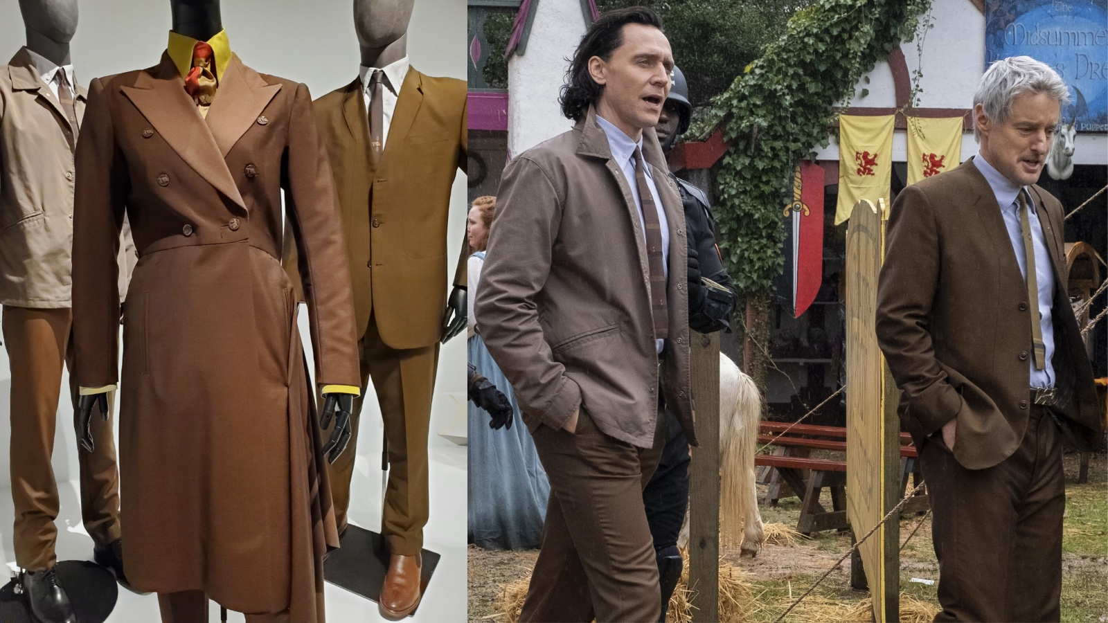
If you heard a human screaming “THE BROWNS DON’T EVEN MATCH???” a few months ago that would have been yours truly finally getting closeup shots of the TVA costumes on Loki, like so:
Now let me be clear: Christine Wada, who worked on Loki, is a good costume designer. She has skills. This article is already too long for me to take you on a dive explaining why so as a shortcut let me just say you can go watch her work (and Gypsy Taylor’s) on Our Flag Means Death, keep an eye out for the color purple, and get ample understanding of how good costume designers can be when production lets them strut their stuff.
Likewise I don’t think anybody who put the costumes together on Loki is bad at their job. Because while I can assure you that these costumes, which were made available to the public to study in a museum, had such god awful construction on them that I nearly put together a collage of closeups so you could learn what bad stitching looks like, I didn’t because I don’t think that’s the costume department's fault.
Instead, what I do think is that the costumes on Loki exemplify the issue with Loki as a whole, which was that from the top down the directive was not to give people what they needed to do their best possible work. The seams on these outfits are one of many examples of this. I don’t think they’re bad because unqualified people were sewing them, I think they’re bad because skilled people weren’t given the time or money to do the job properly. The seams scream the garment version of “Sketches don’t go live on Saturday Night Live because they’re funny, they go live because it’s 11:30pm on Saturday night.”
But even if the garments were constructed perfectly, their design does not work.
There is a reason why I return to the well of Loki again and again as an example of bad color story and costume design. And this is exemplified perfectly in the above photo where we see, as I have screamed, the browns don’t even match.
Let’s back up.
Loki the show’s attempt at a color story was a failure right out of the gate because at no point were its colors consistent. This was most egregious with the color green, which the show told the audience was meant to signify the character of Loki. It was literally the entire point of Alligator Loki from conception to screen. Showrunner Michael Waldron pitched it himself: “there should be an Alligator Loki. And it's like, well, why? Because he's green.” (emphasis Michael)
Got that? Green = Loki.
Okay but here’s the problem. The show slapped filters over everything, including the color green. It was part of the show’s desperate attempt to pretend to be David Fincher with none of his skills or experience. That meant at no time when we saw the color green could we know if it meant anything.
If you’re struggling to understand how bad this was, compare it to WandaVision. Wanda, the Scarlet Witch, has the signature color of red. At no time in the show does red ever signify anything except Wanda or something meaningful to her. Even in black and white, where you can’t see red, when they needed to signify red they used rose floral patterns. And if you needed help knowing that rose = red = Wanda, they helped you out by putting red roses in the graphics of the closing credits.
Loki, for its part, just had green. Green filters, green clothes, green props, just green.
Including in those TVA outfits. Here I’m going to quote Christine Wada when asked about the inspiration for the TVA costumes:
“And that color palette, I definitely tortured a little bit over, because I mean, all that fabric like Tom and Mobius is actually all vintage '50s suiting fabric, the sharkskin.
“I don't know if you really can see it, but what's really magical about Tom's pants is that sharkskin reflects two tones, and one is green and the other's brown on his pants, and green being very Loki. So it was always just like, ugh, the perfect fabric for him, and it's 1950s fabric. But I was tortured over it a little bit, because brown isn't always the most obvious choice for a sci-fi futuristic thing. I felt like it set the tone for the mystery of the TVA and that you think it's a benign sort of this benign organization. And I kind of took a gamble on that brown palette for portraying a more benign organization.” (Emphasis mine)
Did you catch that? First we’re yet again being told that green is supposed to only symbolize Loki. But the problem is even if you never saw an episode of the show you know from this quote green doesn’t always symbolize Loki because we’re being told it’s in the TVA uniform. You can’t put Loki’s colors into the TVA without carrying the message that Loki is connected to the TVA! As in part of the TVA, not just working with it.
But oh! You might say. It’s not a problem because only Loki’s pants have the green tone! The green here only symbolizes that it’s Loki’s pants from the TVA.
That’s great. Because it leads right into the next issue which is that we’re talking about uniforms which represent an organization which don’t have a uniform color.
THE BROWNS. DON’T. MATCH.
People, the intensity I feel about this is on the level of the five year time jump in Endgame, and regular readers know how I feel about that.
The thing about the TVA is that not only was it meant to look benign, as Christine says in the quote above, it was meant to embody drudgery. Monotony. An oppressive sameness that tried to keep anyone working there from lifting their heads up and questioning their surroundings. Brown is a perfect color choice for this. Brown is an even better choice when you’re talking about uniforms, which the TVA costumes are meant to be.
And just to be clear, these are uniforms. The ties all have the TVA logo on them and each garment has buttons that say TVA on them. I’m only not providing closeups of them because, unfortunately, much like the seams, these came out with poor quality. The TVA logos on the ties look to have literally been stamped on with gold ink that either rubbed off during use or was never properly put on in the first place, and the TVA on the buttons - well suffice it to say it looks like the machine making them possibly broke down halfway through production. The TVA logo is in varying levels of thickness and legibility.
But, also much like the seams, I don’t think that’s the fault of the people who did the actual work. I think showing closeups of it would cross the line to looking like I’m calling them out, which I’m not. I’m absolutely calling out production for creating a situation like this, but not the folks who were probably spending many late night hours trying to sew these buttons on by hand.
The important thing is that the logos are there. Which means these are TVA issue, they are uniforms, and they do not match in silhouette, hue, saturation, or value. The only thing we can acknowledge is pattern since they’re all in solids, but even there Ravonna’s tie throws a spanner in the works. But the even bigger spanner is that the hue is supposed to match and it doesn’t.
That’s the thing about uniforms. They’re supposed to look alike. Hence uniform. Uni. One. Singular.
Now they don’t have to look exactly alike. A private in the army doesn’t wear the same clothes or insignia as a four star general. We can allow for differences. But there still has to be something which identifies them as being part of the same organization.
The first way you can have uniforms look like they belong to the same organization is to have them look similar. That’s obviously not going on here because these outfits aren’t the same. Not only that, nothing about these outfits is giving us useful information. Who wears these clothes? Are they meant to be the same type of clothes or are we seeing a range from working wear to formal? Is there a ranking system being shown? If so, who ranks highest in this group? How can we be sure?
The TVA logo on everything does give some clue that there’s a connection between these three, but even so not what. If we know nothing about the show we can guess TVA stands for something but are these people who work for the same company? Belong to the same club? Vote for the same politician? Enjoy the same smooth jazz band? The problems go on and on and the start of the problems is with the silhouettes.
Which isn’t to say that you have to use silhouette to show that people belong to the same organization. You can absolutely mix silhouettes up and still identify people as being in the same group. Olympic teams do it all the time when they have to wear opening and closing ceremony outfits that fit everyone from a tiny gymnast to a bulky weight lifter.
How can you show the group is still a group if the outfits aren’t the same? Color.
Which is why it’s a problem that the browns in the TVA uniforms don’t match. You can change saturation or value but you shouldn’t change the hue. Not when you’ve thrown consistent silhouette out the window. (As a comparison, Star Trek uniforms can change hue because they share silhouettes. You can use hue to denote information like where someone works or how likely they are to survive an away mission because silhouette already told you they’re part of the bigger team.)
You can’t put undertones of Loki green in Loki’s TVA pants because uniforms are supposed to match. So either you have undertones of Loki green in the other outfits, which means yet again green isn’t signifying Loki, or you do what they did and make none of the browns the same because they all have different undertones.
If you need to understand how none of these browns are the same go back up to my color palettes above. Remember the squares I used to demonstrate value and I said we’d be coming back to them? Take a look at the second box from the left in each row. That’s what happens when you start to mix in colors that bring red, yellow, and blue closer to brown. Notice how they don’t look alike? Yeah, that’s the issue. You can’t ignore our pal the color wheel just because you think you’re in the same hue. The baseline colors are still there.
(Don’t worry if you’re squinting next to the blue and wondering where the brown is. It’s closer to grey, you’re not going color blind. The point was to make the same adjustment to each color and show how they shook out differently.)
There’s an old joke about one of the greatest hardships in a goth kid’s life is when all their blacks fade to different colors in the wash. That’s what’s going on with these TVA uniforms. I legitimately don’t know how the Loki team did it. Not a single garment in that picture is the same color brown. I mean to the point where it almost circles back around to being impressive. Even when slapping on the best of color filters in a rare moment when everything wasn’t forced to look green we can see Loki and Mobius still don’t match. And the undertones are where the color filter especially comes into play. If you’re making a - well - uniform adjustment to the entire picture you need to make sure everything is being adjusted the same way. Again look at the palettes. Red doesn’t make the same color white that yellow or blue does. It doesn’t make the same color black. If you don’t have the same undertones it doesn’t work.
I’ll be honest - when my friend showed me these photos my immediate guess was that this wasn’t a choice. This was some poor member of the costume department who was sent to the fabric district with a strict budget and a yardage requirement and told “Just get as much brown as you can find, we’ll make it work.” I’m not saying that’s my magic power guess about what went on behind the scenes. Based on Christine’s comments about deliberately picking the brown/green sharkskin I think there was some thought put into it. But at the same time if it was revealed most of these uniforms were built with a limited fabric stash and a wish I wouldn’t be surprised.
So that’s showing three people, two men and one woman, much like AMC’s Interview With the Vampire did, and what it looks like when every attempt is a swing but a miss. What does it look like when costuming has the same challenge but hits a home run?
Only Murders in the Building, or When Color Story Goes Very Right
I swear on the grave of my most beloved pet I have not watched a single second of Only Murders in the Building. But when my friend showed me the following picture from the same costume exhibition as the above Loki photo, I immediately wanted to make out with the costume designer and have their babies. I mean look at this:
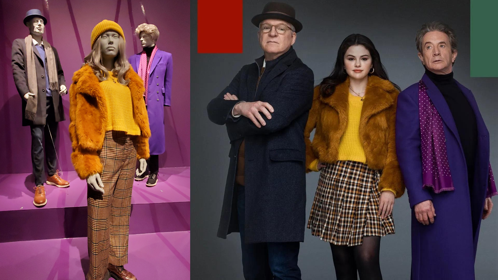
This is just - sweet fucking Jesus this is so good. Ignore the actors on the right for a second. Just look at the mannequins. We’re removing body language again. Look how these costumes are still telling a story! Tell me you don’t instantly start to sense the vibe between these three people.
Now in doing the research for this article I did tap another friend of mine who has watched the show. I told her, based purely on what I saw in these pictures, what I thought the character story of these three people were and I asked her to tell me if I got it right. Now in the interest of full disclosure at the time I didn’t know if I’d be able to use the museum picture for this piece (thank you sharing it, DarkLightLuna!). So I pulled up that publicity shot on the right which, though it’s hard to see, gives an extra piece of information in the different shirt color on Steve Martin’s character. Which means I had an added detail I guessed right which I wouldn’t have had from the mannequins alone. I’ll say which it is, but here, quoted exactly because it was in DMs, is what I told her:
“So would I be off base if I said that Steve Martin's character is more conservative/quiet/thoughtful in personality but secretly has things in common with Selena's character, perhaps in his younger years; Martin Short's character is the opposite of Steve's in that he is big and flamboyant and extroverted in personality; and Selena is fairly hip and popular but shares traits with Martin and Steve which makes the friendship between the two men more solid? (And perhaps has something secretly in common with Steve)”
To which my friend replied: yeah, pretty much. And if we peek at Wikipedia’s summary of the show we find that Steve Martin’s character, Charles-Haden Savage, was an actor in his younger years who is now semi-retired and wants to be on his own. Martin Short’s, Oliver Putnam, is a struggling but still working director. And Selena Gomez’s, Mabel Mora, is a young artist and renovator. Charles and Oliver were friends previously and Mabel is the newcomer with whom they team up to create a true crime podcast.
How’d I pick up all the dynamics? Because costume designer Dana Covarrubias is a fucking genius.
(Also she was working a production that allowed her to be a genius. But let’s focus on Dana for right now.)
You know the drill: let’s start with silhouette! Charles and Oliver both have overcoats. However these overcoats aren’t the same and what they wear underneath doesn’t match either. They are connected but not perfectly so. There’s tension of some kind in the relationship. This is exactly what WandaVision did with Monica and Wanda on purpose and what AMC’s Interview With the Vampire did with Louis and Lestat by accident.
We’ll get to Mabel in a second. Let’s stay on the boys and talk our next buddy pattern: Oliver has a dotted scarf, Charles is all in solids. They mostly match but Charles has that tiny but not insignificant difference. We can tell by his use of any pattern that, in comparison to Charles, he wants to be noticed.
Rounding the corner we get color. Charles and Oliver are in blues and purples. We know from our color wheel that these colors are neighbors. They want to go together. Not only are we getting happy puzzle pieces clicking together on hue we are also getting matches on saturation and value. Though Oliver’s purples are easier to see in a crowd than Charles’s blue, they are sill on the same level.
Now let’s bring Mabel into play.
Mabel is also in layers. Her outfit, particularly in the mannequin version where she’s wearing pants, suggests a similar silhouette. Now before you get on me by saying the show takes place in New York City during cold weather so her wearing a coat doesn’t mean anything, I’m going to counter with how there are many silhouettes someone could wear to stay warm. Putting Mabel in a coat like this was a deliberate choice by Dana Covarrubias to use coats to tell a story. The story it says here, which we can see even when the coat is hanging off a mannequin, is that Mabel likely has some connection to Charles and Oliver in the show. Again: Monica, Wanda, Agatha. Not the exact same outfit, but silhouette is helpfully grouping them together.
Mabel’s silhouette in this particular outfit also lets us know her character is more flamboyant as a concept, but also in relationship to Charles and Oliver. They have solid coats made out of what I’m assuming are wool. Hers is a fun and floofy faux fur.
How about pattern? From the top up Mabel is in solids, which helps match her to Charles and Oliver. On the bottom in both the mannequin and the promo photo Mabel has on plaids. However, her plaids don’t clash with Charles or Oliver. These are not Agatha’s plaids forcibly reminding us that she is not connected to anyone else. If anything, Mabel’s plaids help connect her, which brings us to color.
Mabel is in a beautiful, brilliant, rich, saturated, golden yellow. What’s golden yellow on the color wheel? A compliment to blue and purple. Mabel is the “pop” of color that Charles and Oliver desperately need. By being near them she makes them look better. Ergo we can conclude that when her character is with them, she improves the dynamic of their relationship.
Not only that but peep those plaids again. In both the mannequin and skirt versions, her plaids bring in elements of color from Charles and Oliver. Especially Charles, which was why when I was on my own I was guessing that Charles and she had something in common. This was cemented further when I saw the publicity photo in which Charles is wearing a sweater which matches the color of Mabel’s coat. That’s how I concluded that not only did Charles share something in common with Mabel, but it was something from his younger years. I could also guess this was something Charles didn’t like people knowing about, because it’s a color he keeps close to his chest and hidden under that dark blue jacket.
(In the mannequins he’s treating his friendship with Oliver in much the same way: the purple is close to his chest and easily hidden by the overcoat.)
And this is with off the rack clothing. So first off, never dismiss the work of costume designers even if they’re not personally designing and sewing each garment by hand. Whether they’re pulling clothes from a warehouse or from the local Nordstrom’s, they are still putting the work in. Second look at this freaking work! Even knowing nothing about the show, nothing about the characters, heck even with the positioning of the mannequins actually kind of suggesting that the woman in this picture isn’t connected to the men because she’s standing further away from them and not on their level (compared to the Loki mannequins which were all on the same level and standing close), you still know that this is a trio in the first place, who met who first, and what the relationship dynamic is between all of them.
Just from the clothes. This is insanely good. This is great costume work. I still haven’t watched the show so I can’t go on in further detail about the job Dana Covarrubias and her team do, but again the beauty of this costume design is I didn’t even have to! Chef’s kiss. Brilliant. Love it.
Now let’s take what we’ve learned from the worst (Loki) and the best (Only Murders in the Building) and let’s look back at Claudia, Louis, and Lestat once more.
AMC’s Interview With the Vampire, or When Color Story Just Is
Putting together everything we know, let’s look at Lestat, Louis, and Claudia again. Let’s use a new picture so we can put fresh eyes on it.
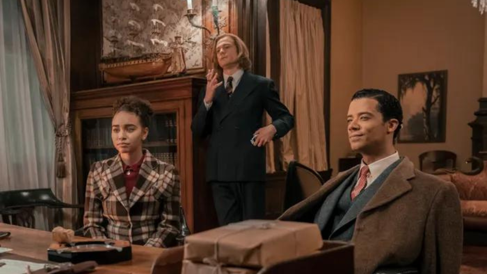
What’s going on here? If you didn’t know the show, what story is being told? Who are these people? Do they know each other? Do they have anything in common? Is this a group of people who have lived, loved, and hated together for decades or three complete strangers being introduced for the first time over the reading of the will of an uncle none of them knew they had?
You know the drill: Silhouette. Nobody matches. We can allow for a “is wearing a coat” maybe (which… again this is New Orleans. I get that Louis the vampire might not care about temperatures but why is he choosing to wear so many layers in a tropic zone? It would make him stand out and at this point in the show he’s especially trying to fly under the radar as a supernatural being. Again, I get that this scene takes place in winter. I similarly again remind you that I’ve lived there and the brief cold days do not justify these clothes even for mortals.)
Next up we have pattern. Lestat and Louis are mostly in solids. This sorta kinda works for the story at that time because Louis is having a hard time letting go of his affection for Lestat so the solids making a connection between them could possibly work. Except notice where the solids are here: very visible on the outside. The connection Louis is feeling should be hidden, because he’s struggling with it and trying to pretend to Claudia that it’s not a big deal. We should be seeing it more in his inner layers than his outer. Compare it to Charles and from Only Murders in the Building and where he wore his bright colors.
In contrast the person whose solids actually do work for this scene is Claudia. Her signature red is on the inside, covered up by her coat. It’s a solid, like much of Lestat’s clothes. In this scene she’s secretly plotting to murder Lestat. So if red on her is meant to symbolize her bloodthirsty nature this is actually well done. She’s hiding her true intent and the object of her intent can be guessed by her clothing.
But you can see how it again causes problems in relationship to the others because if clothing kept hidden has meaning on her then it is supposed to have meaning on Louis and Lestat as well. Lestat and Louis’ shirts don’t tell us anything. Their ties don’t even say anything. We can’t even say that Louis’ red tie connects him to Claudia’s red because it’s not the same color red in saturation or value (the Loki uniform problem again) and his tie has a pattern on it. The pattern doesn’t even connect to anything else in the room because it looks to be gold (and is probably an even more brilliant gold if there wasn’t this silly brown filter over everything to make sure we don’t forget this scene doesn’t take place in modern day).
Then we have Claudia’s plaid which does not connect her to anything in the room. This isn’t Mabel’s plaid, coordinating and complimenting the older men in her life. It doesn’t have colors that match anything Louis and Lestat are wearing. If anything Claudia’s colors here most match herself because the pop of color in her coat is once again her signature red.
Likewise her use of pattern at all isn’t connecting her to anyone. Mabel wore visible plaid and while it didn’t match anything Charles or Oliver wore, Oliver still wore a visible pattern in his easy to see scarf. Oliver also had vibrant, saturated colors like Mabel did, and his colors especially were complimentary to Mabel’s golden yellow. It wasn’t the same but there was enough in common that you can see this being a dialogue. The pattern version of Wanda and Monica’s layers: not the same, but grouping them together.
Instead Claudia here is the only one in a noticeable pattern and it’s a bold pattern at that. Her plaid is not Lestat’s occasionally seen subtle pinstripes. You can see her pattern from a block away. So what’s being suggested here, much like what went on with her patterned red dress in the bench picture we saw above, is that she is not connected to these men. She’s her own free agent and these guys just happen to be near her.
Which is why I asked my friend if we were getting a reveal that Claudia was secretly betraying both Louis and Lestat the whole time. Because if so her clothes were telling that story perfectly by showing us that she was not particularly attached to either of them. But that wasn’t the intent. Claudia’s clothes were telling her story - and again telling her story very well, no question - but because it was purely Claudia’s story there was nothing tying her to the stories being told by Louis and Lestat’s clothes. And Louis and Lestat’s clothes, as we already covered, were telling the stories of completely different people.
Now that we’ve covered that, let’s bring it on home by talking about the most unfair comparison anybody could make, and that’s to the costuming work of Ruth E Carter.
Why the Academy Award for Best Costume Design Should Be Renamed After Ruth E Carter
Let’s be clear: Ruth E Carter is a living god of costumes. She sets the bar so high it’s in another freaking universe. I’m going to talk a tiny bit about why right now but entire college courses could be done on how she designed for a single movie, let alone her whole career. Her work is insane.
Likewise please understand that I’m not pulling Ruth into this discussion as a way of pointing back at Carol Cutshall and saying Carol and her team’s work was substandard in some way. Instead this is about scale. Loki shows the worst. Falcon and the Winter Soldier is good. AMC’s Interview With the Vampire is very good. WandaVision and Only Murders in the Building are better. Anything Ruth E Carter touches is the best. We’re using the various projects to show what makes the difference in quality from one level to another.
Heck, if we were using a grading scale it’d be Loki at a D (avoiding that F because I’m giving extra credit for how Sylvie’s outfit was designed to allow Sophia Di Martino to breast feed). Falcon and the Winter Soldier gets a B+ (great silhouette and color story but otherwise not breaking new ground). AMC’s Interview With the Vampire gets a B+/A- (beautifully made outfits which occasionally tell a story that connects to the show, but lacks coherent stories in use of color and pattern plus undercuts itself by using outfits that are historic but only superficially applicable to the characters), WandaVision and Only Murders in the Building are an A+ (color, silhouette, patterns all work to consistently and flawlessly tell you about the characters and the story), and anything Ruth E Carter touches is so amazing the letter system doesn’t even apply anymore. It’s not even S Tier. It’s beyond that. It’s the Ruth grade. You can’t grade the level because she is the level.
So let’s talk about that. For the purpose of this article let’s narrow it down to Black Panther and a moment which compares to what we’ve just been talking about, which is three people together:
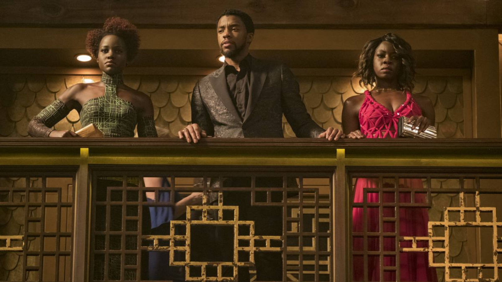
Ryan Coogler and Ruth E Carter have both spoken about the thought process behind Black Panther. Ruth talks about some of her work here when discussing T’Challa’s arrival scene and Ryan here when talking about the scene this picture is from. So when I talk about some of the things going on here, I’m pulling directly from their own words. Also let’s pause to give a well deserved shout out to Hannah Beachler who is to production design what Ruth is to costuming. Hannah, Ruth, and Ryan all worked together to make what’s going on in Black Panther as good as it was. (And if you want insight into how much more work they put into Wakanda Forever, check out Hannah’s twitter where she shares some of those tidbits.)
This is going to be a little bit like Into the Spider-Verse where it’s going to be impossible to cover all the amazing things happening here, but we’ll at least try to hit some aspects to give an inkling of an idea.
We have two women and one man so silhouette isn’t telling us that they’re connected. But that’s okay, because the silhouettes are being used to give different information that we’ll get to. Instead let’s skip to color. T’Challa is in black because, yanno, he’s Black Panther. Like Wanda he’s got a signature color and the movie never forgets it.
Nakia and Okoye are in red and green. Going back to our buddy the color wheel, red and green are complimentary (anybody who’s seen a Christmas decoration already knows this). They are on opposite sides but flatter one another. Keep that in mind, we’re coming back to it.
More importantly of all, what do red, black, and green make? The Pan-African flag. This was a deliberate choice by Ryan Coogler. Part of the goal of Black Panther the movie was to celebrate and tell the story of African culture, African people, and the African diaspora. All of which is symbolized in that flag. Repeated use of red, black, and green in this movie is on purpose.
And not for nothing, but if you’re putting together a movie or TV show which, among other things, is intended to celebrate a group of people and where they live, you can do a heck of a lot worse than using the flag of that location as the starting point for your mood board.
(Pssst - the colors of the Madrigal family are based on the colors of the Columbian flag. The only exception is green, which is used to symbolize the ability to see the future. That’s why it’s the color of Bruno’s power as well as Mirabel’s glasses. Encanto is another A+ movie as far as this sort of thing goes which is why I’ve already gone on at length about that.)
Pausing here for just a second, I’m not saying that Claudia, Lestat, and Louis had to be put into flag-related color boxes. However, the show was celebrating New Orleans. Louis was already being connected with gold and Lestat occasionally favored green. At that point just slam dunk it by putting Claudia in purple. Alternatively, if they were so fond of Claudia’s signature red and of putting Lestat into blue suits, toss Louis into white and give us the French flag, which would’ve also been apt for a story of a French person falling in love with a Creole set in New Orleans.
Again: cannot stress that the show did not have to do this. I’m just pointing it out as a contrast for what did happen, which was no connective color story at all. Using colors symbolizing the location being celebrated in the story would’ve been a super easy way to course correct that.
Moving on!
Nakia is in green not just because that’s one of the colors of the Pan-African flag but because in Black Panther green represents the River Tribe, where Nakia is from. Much like WandaVision, Black Panther never misses on this. If you see green in clothing or props it means River Tribe. This is not Loki and “Green means Loki except when it means TVA or it means absolutely everything because it was the color of the filter we felt like using that day because we were taking a break from misusing the purple filter which was a color we also totally screwed the pooch on in terms of symbolic meaning for this show, thanks for asking.”
Ahem.

Okoye is in red, which in her case symbolizes the uniform of the Doras. We could do an entire discussion of the Dora Milaje, their outfits, and the insane amounts of work put into them. Luckily there’s another article which covers some of that so I can fight my urge to go down that path. (But just…. I mean I know it’s deeply unfair to do this but compare Ruth’s thought process on the Dora uniforms vs Loki. Loki didn’t even have to go anywhere near any of that but neither did it even try. It’s killing me, Smalls. Killing me.)
But if we force ourselves to just look at Okoye’s outfit in this photo, note that Okoye has yet another signature color: gold. She is the leader of the Doras and only the leader gets to wear gold. Gold accents her dress and is used in her necklace and bracelets, the latter of which echo the collar and cuffs that she wears in her uniform. The fact that she’s using jewelry to do this is appropriate because the armor on the Dora outfits was specifically designed to look like jewelry. This ties into the concept of how one of the things the movie wanted to highlight is feminine strength, which we’ll talk more about in a sec.
What this tells us is that Okoye values her position very highly and wants to identify with it even when she is working under cover. A random person in a gambling den might not know that red + gold = Dora leader, but Okoye does and so do we in the audience.
Also - I promise I’m not going to keep getting distracted but consider the beautiful simplicity of Okoye’s gold as a marker for who is the leader of the Doras. It means that even in a scene of them all together in similar outfits, your eye can easily spot who’s in charge. There’s one person with gold, everybody else has silver. Compare that to the TVA uniforms where nothing about Ravonna’s outfit tells us that she ranks higher than Mobius or Loki.
Also also, notice how the Dora outfits are built so that they can both tell stories about the individuals wearing them and connect to the people around them. Not only that but Ruth is putting generational stories into these uniforms! It’s not just Ayo having a uniform she looks good in, it’s giving us Ayo’s family specifically through her matrilineal line. Do you start to understand why I say Ruth is in a class entirely by herself? This is fucking ridiculous and it’s just one outfit.
Ahem. Okay. Back to the photo.
Remember how I said that red and green being complimentary colors was important? Nakia and Okoye have complimentary stories and personal values. They share a love for Wakanda, but they act on that love in different ways. Okoye represents tradition. Accordingly, her dress is softer and more classical. She’s got straps over her shoulders. She’s got a V-neck in the front and a halter in the back. It’s a beautiful garment but nothing about it makes you think of words like avant garde when you see it.
Conversely, Nakia represents innovation. Her dress is innovative. It has an unusual collar, and arm bands instead of sleeves. It also has a silhouette that stands in contrast to Okoye’s: Okoye has a bare neck and arms, Nakia’s neck and arms are covered. This is what I meant when I said it was okay the silhouettes didn’t match because the not matching was on purpose. Again, like the Dora uniforms, we’re getting stories about the characters as individuals and then even more story when we put the characters next to each other and see how their outfits interact.
To appreciate just how much Nakia’s dress represents innovation, let me quote from this article from The Atlantic which describes how the dress was made:
Take, for example, Nyong’o’s character, Nakia—a Wakandan spy—in an exaggerated cold-shoulder, floor-length gown with splits to each hipbone. Carter and her team created this textile from scratch using design software, inspired by the kente pattern made by the Akan people of Ghana. Carter simplified its color palette to showcase the pattern’s intricate geometric shapes. She then transferred it onto black fabric, using a 3D printer to make the graphic lines raised and textured. After constructing the silhouette, she hand-painted the dress in an electric chartreuse hue to accentuate that raised outline, creating an ombré effect as the green fades to black down the length of the dress. “As a member of the royal family,” Carter said, “[Nakia] needed to be unsuspecting, but then she needed to be able to kick some ass.”
Are you seeing just how much detail which symbolizes the story is was put into the garment? You have the research Ruth did into real world patterns and textiles so that various African countries could be honored by the movie. You have the use of 3D printing to create new things which ties in to how Wakanda is a nation far more advanced than any other on the planet in the MCU. You have that silhouette which we’ve already talked about. You have the translation of the inspiration patterns into the color palette of the movie, then you have hand painting to truly bring that beautiful green to life.
ONE. OUTFIT.
THEY DID THIS THE ENTIRE FREAKING MOVIE. DO YOU UNDERSTAND WHY I SAY RUTH E CARTER IS A GOD?
We’re not even done talking about these specific clothes!
As someone who represents tradition, Okoye fights in a traditional style. As such, when the time comes that she has to kick ass, she produces a traditional weapon - a vibranium spear - which she had hidden on her. Her movements are flowing and like a dance. The skirt of her dress also flows and thus helps us appreciate her physicality.
Conversely Nakia is innovation. Because the casino didn’t allow weapons Nakia, who didn’t sneak any in like Okoye did, has to improvise. She takes off her high heeled shoe and uses it to hurt someone. Catch that? Innovating in the moment with the tools she has on hand. In order to set her up for this, costuming had to consider what kind of shoe would work for her outfit and would work as an improvised weapon.
Which brings us to another aspect of the clothing and one of the intents of the movie, which was to showcase femininity and Black femininity specifically. We’re seeing this in the outfits. Okoye’s soft dress highlights her fighting style. Nakia’s high heeled shoe becomes a literal weaponized femininity. If we take a step back from the costumes we’re seeing it in their hair as well. Nakia, like all Wakandans, has natural hair. Okoye, as a Dora, takes pride in her shaved head but because she’s undercover she has to wear a wig. When the fight starts one of the first things she does is remove the wig and use it as a weapon, thus reclaiming the honor of her traditional look.
Going back to Nakia’s shoe, again it’s something that’s not just telling a story about that character in that moment, it’s telling more of a story when you pay attention to what other people are wearing. In general Wakandans either go barefoot or wear sandals due to the warm weather and ground beneath them (M’Baku’s people in the cold and snowy mountains being an exception). Nakia putting on a high heel shows she’s not at home anymore, she knows it, she knows how to blend in with outsiders, and she knows how to set herself up to not be at a disadvantage if things go wrong.
And all of this isn’t even getting into things like the use of triangles in patterns and silhouettes in this scene and throughout the film to symbolize sacred geometry and the strength of the Wakandan people. Nor is it talking about the huge numbers of African tribes and countries Ruth and the team did research on to draw real world inspiration for each of the Wakandan tribes and how they applied that real world inspiration in ways which were meaningful to the tribes and to the specific people wearing them.
(Fun fact: the color blue in Black Panther represents colonization. If you’re aware of that, the color of the most well known member of the tribe which wears blue is a weetiny bit of a spoiler for the movie. Again, y’all, Ruth doesn’t miss.)
On top of all that we haven’t even talked about T’Challa’s clothes, and how even in his signature black he’s got patterns going on and things that represent him as king of Wakanda and how cutting edge real world designers were brought in to shape his look as the Wakandan leader who finally decides to reach out to the rest of the world and where triangles show up in his outfits and on and on and on because, again, this one movie’s costumes could be an entire freaking college course.
Instead we’re going to call it here, because we have to stop somewhere, and just bask in the fact that really the only thing we talked about were two outfits and we still had volumes to say and we didn’t even cover it all for those specific clothes.
Ruth “Mother Freaking Goddess” E Carter.
Conclusions and Content Considerations
I hope that this whole thing has helped give some insight into what goes into costuming and what details take costume work from good to great.
I want to emphasize again that Carol Cutshall did wonderful work for AMC’s Interview With the Vampire. As I said before, it was so good that the fact that the extra step wasn’t there was surprising me. She and her team had a monumental task with all of these costumes and they rose to the occasion and produced pieces of impeccable quality. To my eye it felt like watching somebody run a marathon, reach the last inch before the finish line, and stop. For me in the audience I felt like I was constantly pointing to that inch and going but why would you? It’s right there! I can see you can see it! Why wouldn’t you go that last tiny bit?
And I think, as I said before, it was the giant learning curve of not only taking on a historic project like this for the first time but also a decades spanning historic project that did it. Carol had to give herself her own university level crash course in historic outfits and the fact that she did as well as she did is to be commended.
(Even if I do groan that she joins the far too common ranks of costume designers whose education about historic clothing somehow left them spouting the tired and inaccurate canard that women stopped wearing corsets because corsets were horrible torture devices. I mean I could go on a whole rant about that but for the sake of keeping it brief I’ll just say that the reason why women stopped wearing corsets in the early 1900s was not because, after centuries of wearing them, somehow they all magically woke up one day and said “Hey! These things are uncomfortable!” Let’s give our ancestors just a weetiny bit more credit than to keep using a garment that they hated for hundreds of years, shall we?)
(The amount of parenthetical I just erased here, people. YOU’RE WELCOME.)
Back on the good - and also on the topic of me erasing things for space - I also want to stress that I have completely skipped over the things that were done well on AMC’s Interview With the Vampire and that was purely to try to keep this monstrosity of a post on something resembling a coherent thesis statement and at a wordcount at least slightly under War and Peace. I could wax rhapsodic about the Mardi Gras outfits for Louis, Lestat, and Claudia and how well they told the story. I could absolutely point to moments with Louis and Lestat where silhouette worked well (the “my two dads” moment of Lestat wearing a sweater, for example). There were also moments where the lack of connection via color or pattern worked for the scene (like Louis’ white suit with stripes in episode three).
The reason why I didn’t is, first off, again for the sake of space. But also because I couldn’t pull references to confirm or deny one way or another what the intent was of those moments. I didn’t want to have examples where I was saying well I guess this is what’s happening - for good or bad - if my guess was all I had to go on.
Instead I hope what we have here is something that at least started an understanding of silhouette, pattern, and color in costuming and how costume designers can use those three things to tell the audience about the characters, the setting, and the story on levels from bare bones basic all the way to god tier. Along with it hopefully an appreciation for the actual work, time, and effort that goes into coming up with the costume story, finding the outfits, and spending late night sewing on those buttons and beads for something that might not even be on screen for a full minute but which still has an impact.
And maybe as an added bonus what it’s like to have a production where the costume team is supported in showing off their talent and skill instead of when you have clothes where the BROWNS. DON’T. MATCH.
Ahem.

Thanks for reading!


